Finastra
Design System for two trade finance applications
Finastra is one of the largest financial software providers in the world, used by banks and other financial institutions. The work centred on two B2B web applications for international trade finance, the banking services behind imports, exports and lending. Both were legacy applications with complex flows and an interface that was due for an update, and we were brought in to modernise them, in both user experience and visual language. I joined as one of the designers and went on to lead the programme's design system.
- Role:
- Design System Lead · Senior Product Designer
- Year:
- 2025–2026
2
trade finance applications built on the design system I led
30
components and 10 foundations designed
422
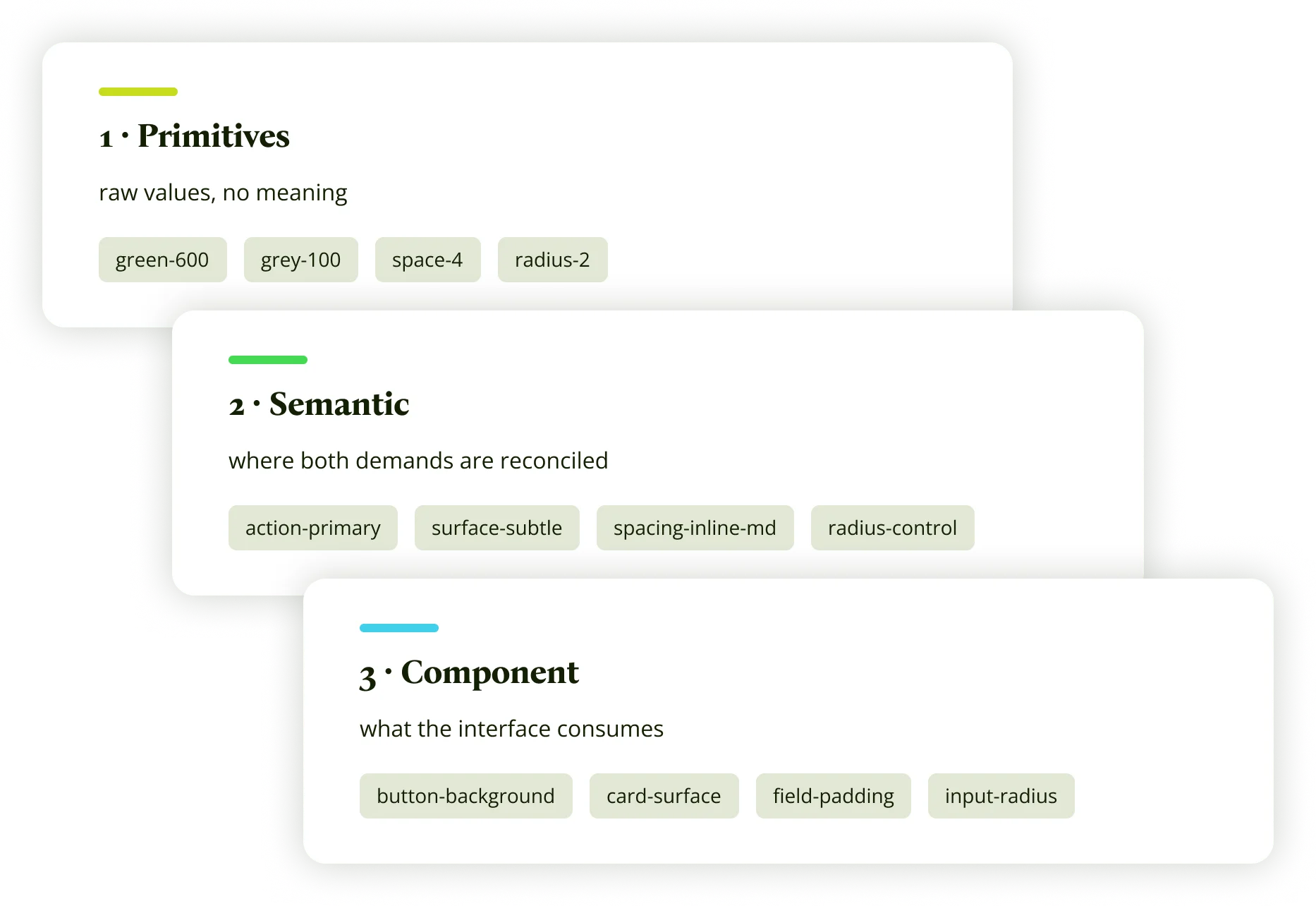
tokens in three semantic layers
The Decisions Behind
I led a design system built to bridge development and the client's corporate system through a shared token system.
The challenge
Two legacy trade finance applications, with very complex flows and a lot of room to improve, had to be modernised on a brief that was still being defined, with a small design team spread across three continents. Both applications needed one visual line while we built their design system from scratch. That system had to stay aligned with the client's corporate design system, which was being redesigned in parallel, and its tokens had to speak the language of Angular Material. Development needed answers before the system was ready.
What I did
- Argued that the main problem was UX and flows, not only visuals, and asked for a dedicated UX designer.
- Designed the first pages of the first application and set its visual line, which another designer later carried forward.
- Helped align the second application with the look and feel of the first.
- Led the design system and built its new token system, while still guiding the visual line of the first application.
- Set up focused channels and regular sessions with development, so they could keep building while the system was still being designed.
How I got it accepted
I took the time to explain the reasoning behind each decision, from the tokens to the components to how design connected with development, so the client's design team could judge it on its merits. Over time that shared understanding made approvals easier. When our components departed from their designs, they agreed to keep them consistent with our system instead of adding exceptions just to match. The design system became the central deliverable of the programme.
The token architecture
WHAT DEVELOPMENT NEEDED
Angular Material
The developers’ framework. What does not fit here does not get implemented.
THE LAYER THAT RECONCILED THEM
The token system I built
The three levels and their naming are the decision. The semantic level is where both demands meet, and where each case had to be resolved one way or the other.
WHAT THE CLIENT NEEDED
Client corporate system
It was being updated while we worked, and stayed in use elsewhere, so it could neither be replaced nor ignored.
THE RESULT
Why it mattered
Without that layer, a brand change would have meant touching components one by one, across two applications at the same time. The design system, built from scratch, became the central deliverable of the programme.
2 trade finance applications · 30 components · 422 tokens
What we delivered
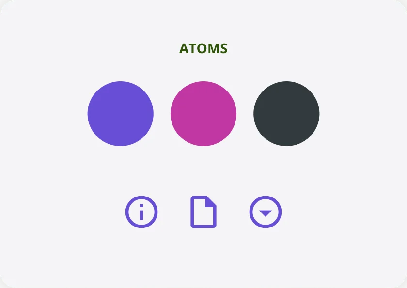
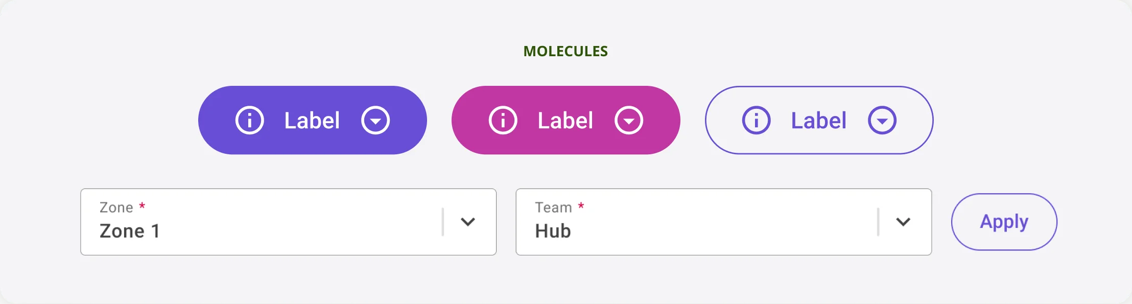
Atomic design
The system was organised in three levels: atoms like colours and icons, molecules like buttons and fields built from them, and organisms like the app bar that build whole areas of the interface.

Structure
Three layers of tokens, aligned with Angular Material and with the client's corporate system, so a change at the base reaches every component.

Components
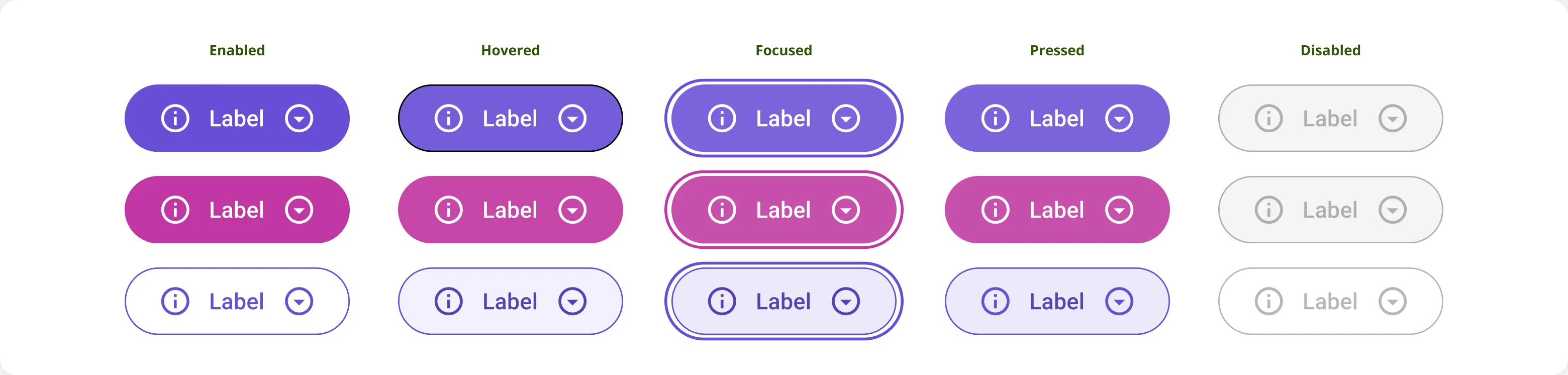
The library both applications draw on, with every variant and state defined. Buttons, shown here, are one of 30 components.
Documentation
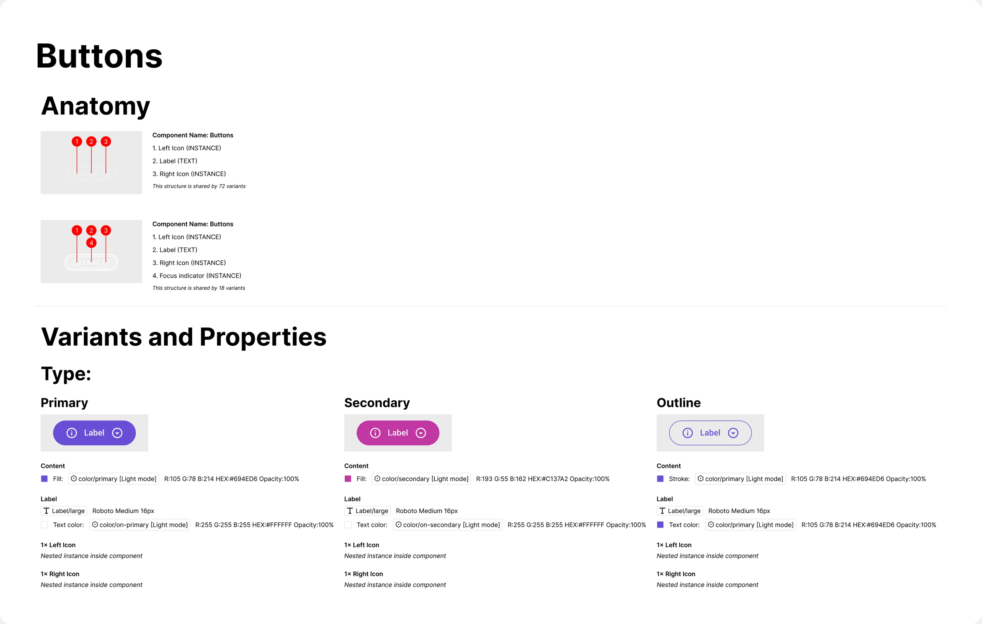
How the system is used and extended: each component documents its anatomy, variants, properties and the tokens it uses.
Next project
Indeed
Enterprise Design System
View project