
Indeed
Design System
Indeed, one of the most widely used job search engines worldwide, connects job seekers with employers through an intuitive and efficient platform. To strengthen its digital identity and enhance the user experience, the project focused on creating and maintaining a design system to standardize and improve usability across all its products. This system not only ensured visual consistency and accessibility but also streamlined the work of design and development teams, enabling scalability and coherence across the platform.
Process
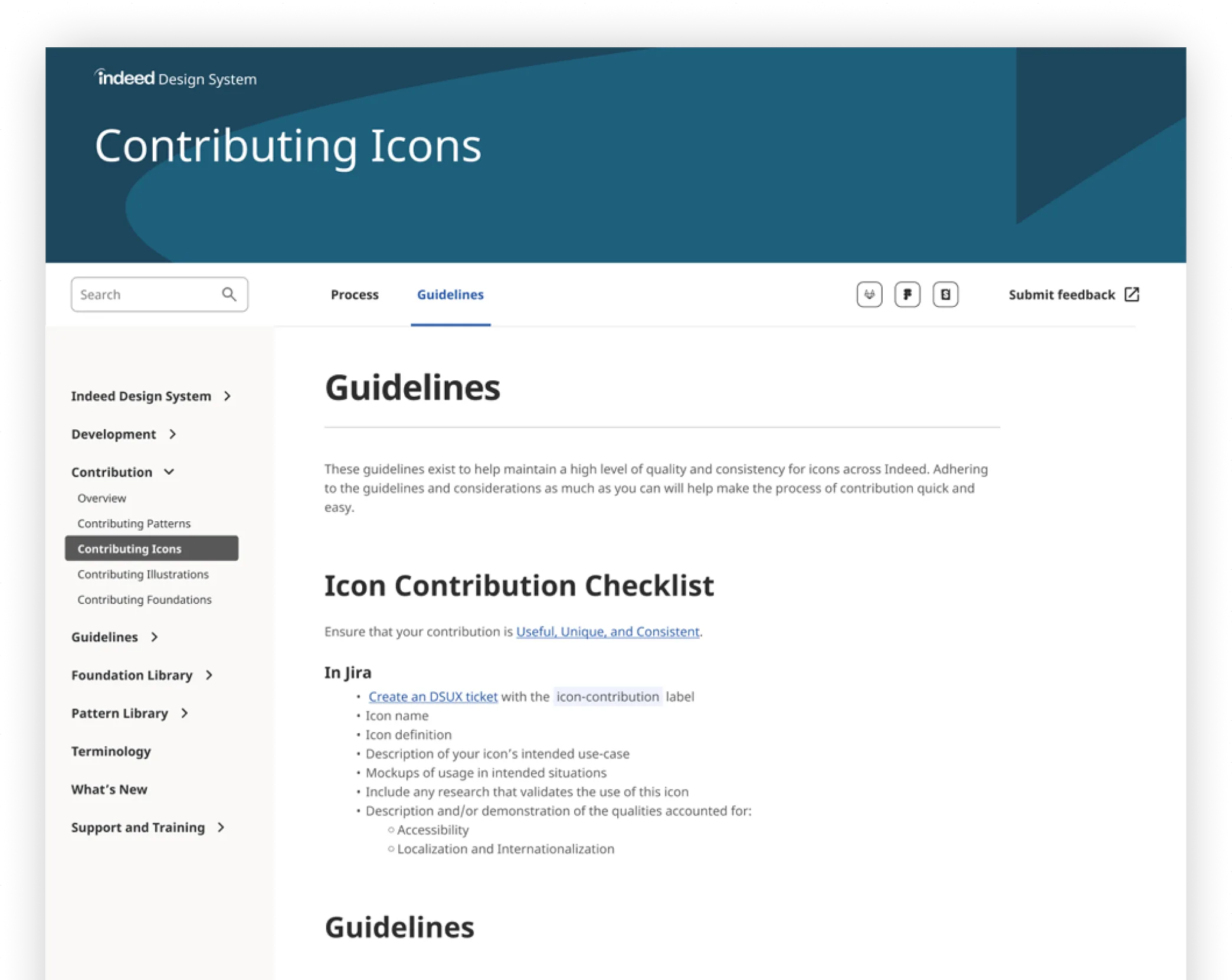
As part of Indeed’s design system team under the Staff Augmentation model, my role focused on designing components and icons for the design system. Along with my teammates, we conducted thorough benchmarking for each component, analyzed its usage in the market, and created initial design proposals, which we refined as a team before final approval. While I contributed to several components, my main focus was on the iconography system, where I identified and corrected structural inconsistencies in existing icons. Together with two other designers, we established a new foundation for the icon system. Additionally, I designed the website for the design system documentation, including custom illustrations for its content.
Challenge
One of the biggest challenges was correcting inconsistencies in the icon anatomy, as many had already been approved. To address this, I presented design-based arguments to the team and the UX director, demonstrating the issues and proposing a solution. Eventually, I received approval to rebuild the icon system from scratch, with two designers joining me in the effort. Another key challenge was balancing timelines and quality between design and development, particularly when implementing improvements and corrections. Fortunately, the strong collaboration between both teams made these adjustments possible.

Components Design & Documentation
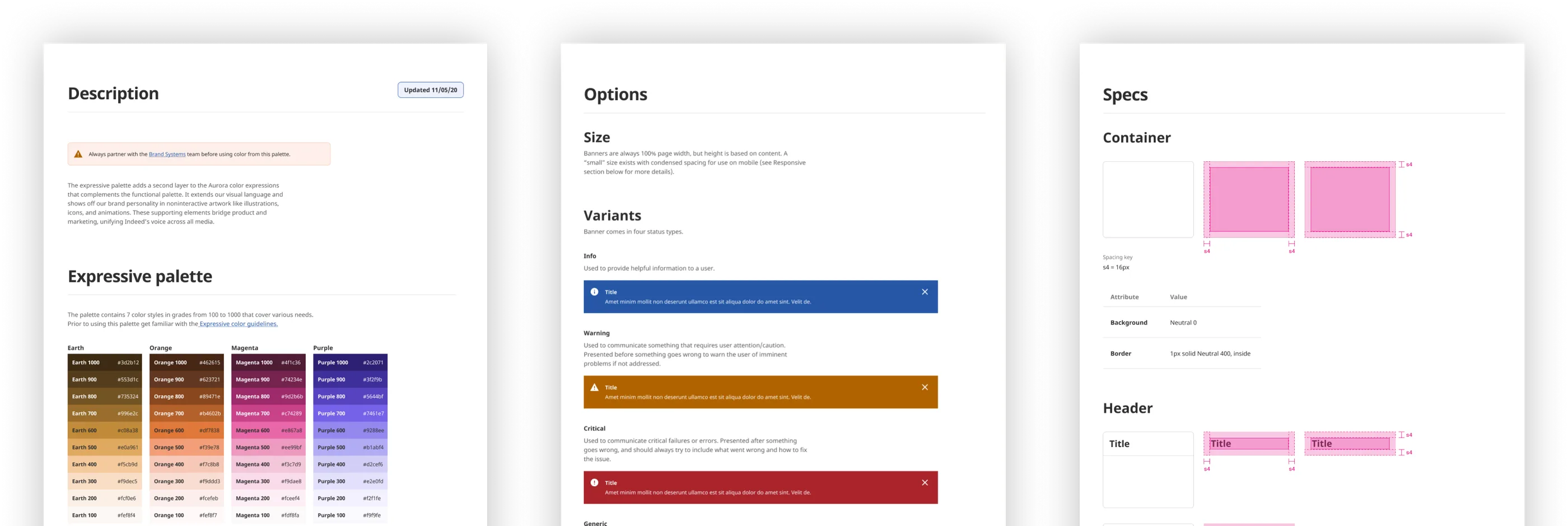
Meticulously designed components. Our process always began with a benchmark of each component, where we identified use cases, studied UX best practices, and designed an initial version to present to the rest of the team for feedback. From there, we refined and finalized each component of the design system. Periodically, we conducted user testing to assess functionality and determine if any adjustments were needed.
Icons Anatomy Revised
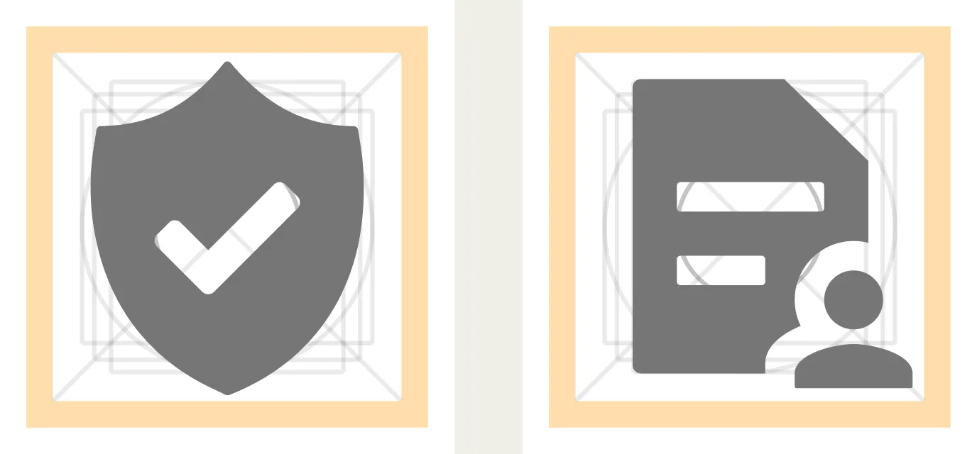
Initially, I identified an inconsistency that made the icons look disproportionate when placed side by side. To fix it, I analyzed various design systems and created a structure that allowed us to design the necessary icons while making the fewest possible changes to those already created. From there, we continued designing the remaining icons based on this same structure, ensuring proportionality across the entire icon set.

Guidelines to ensure visual consistency
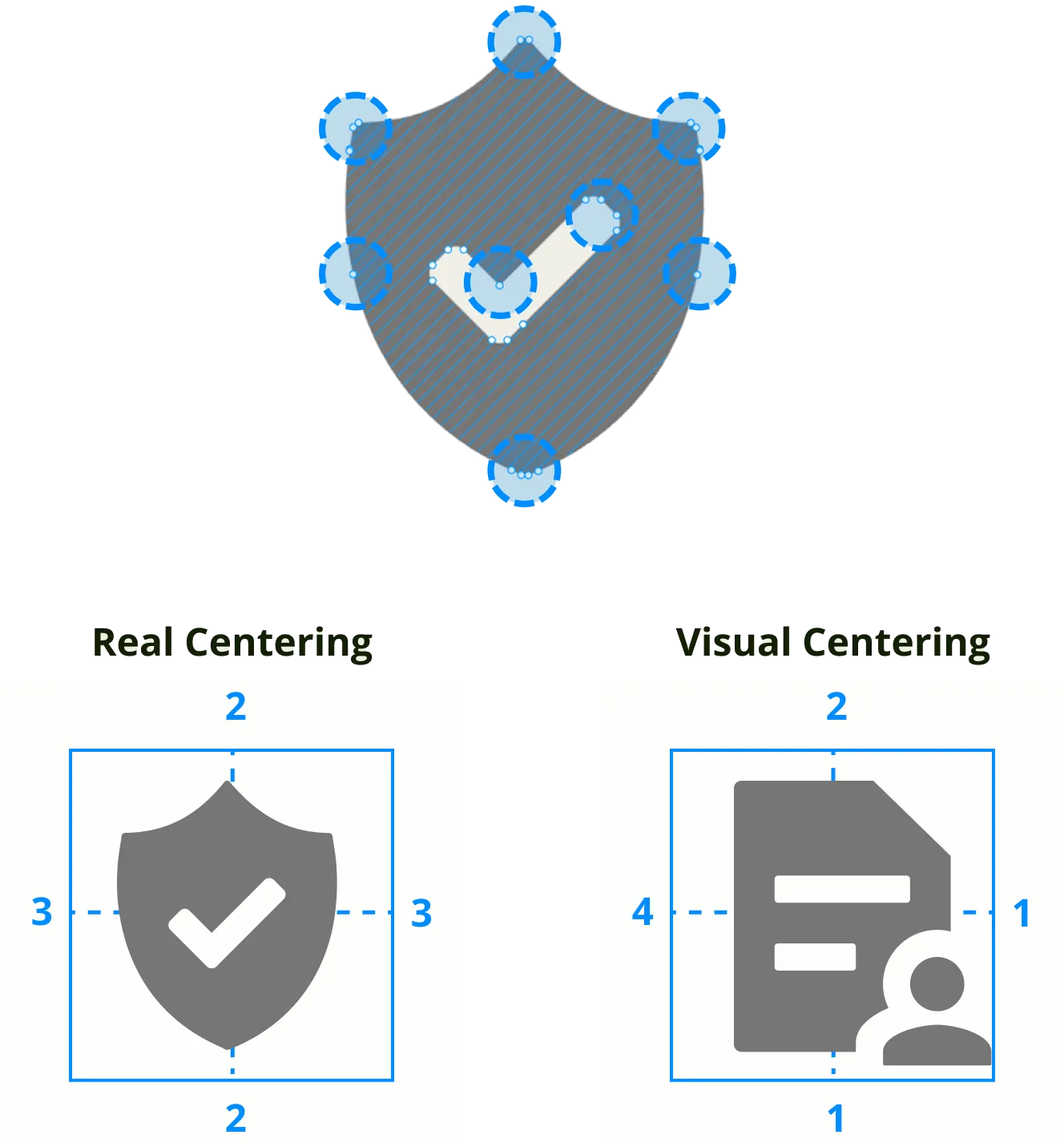
We designed and documented highly detailed guidelines regarding corners, alignments, line thickness, and the use of supporting secondary icons to maintain visual consistency throughout the entire icon system.