Web

My House

Davivienda, one of the most importnat and iconic banks in Colombia, wanted to make a website where users could search house and apply for the mortgage with them.

We should find the pains and frictions of the process and try to minimize them through making the digital experience as seamless and user friendly as possible.
Client:

Davivienda

Agency:

Xperience Design

Year:

2018

Role:

UI Team Leader / UI Senior Designer

Process

The Service Designers conducted interviews with users and stakeholders, defined User Personas and created Journey Maps that I later convert into User Flows. I called an initial meeting with the team where I explained those flows, assigned responsabilities, timelines and general design guidelines for the UI team of which I was also part as a Senior Designer. Then we made a high-fidelity prototype that we finally tested with users.

Challenge

We had two major challenges, the first one was to try to simplify the complex home loan applicaiton process through the interface, and the second was to offer a great property search experience.

Design

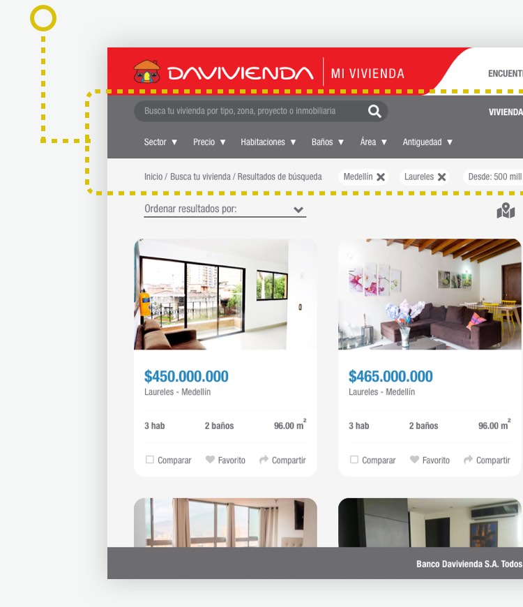
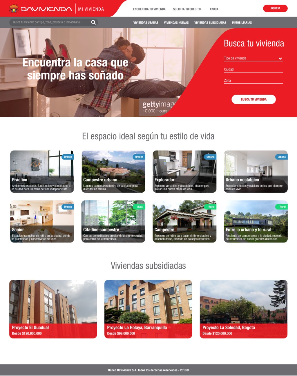
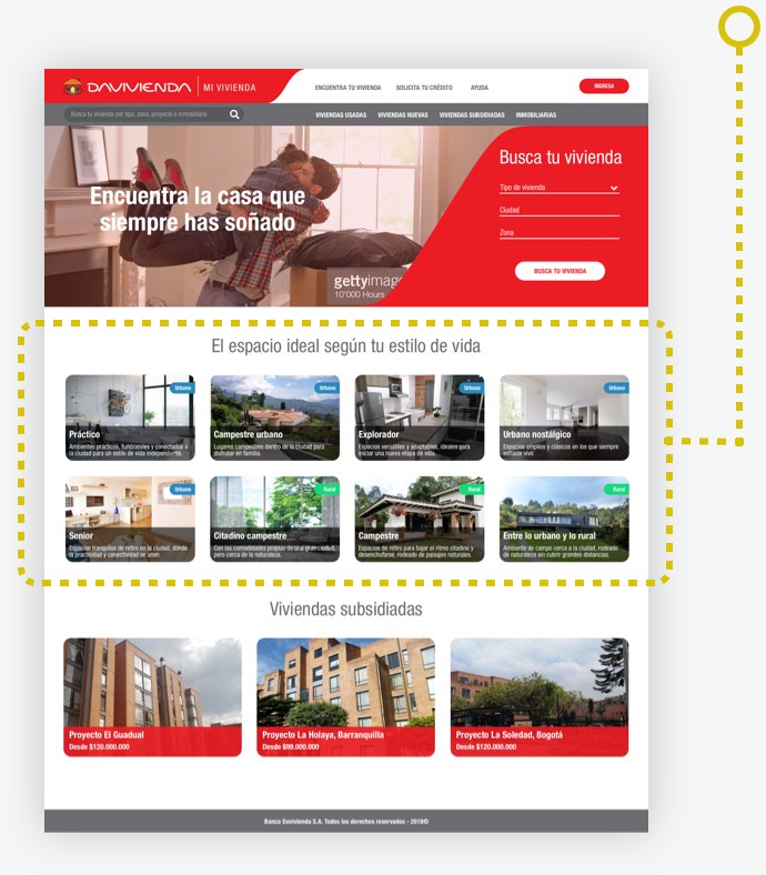
Home con cards de búsqueda resaltados

Different Search Experience

We defined a search structure by lifestyles that would complement the typical search by filters common in this type of portals. This would facilitate the experience for those users who are looking for a home based on their style.

Filtering system relevance

For the filters we used a mix of selectors and chips that display results in real time. We gave them relevance through placement and the sticky display, and also by arranging them along the top section, like a main navigation bar.

sección de filtros resaltada
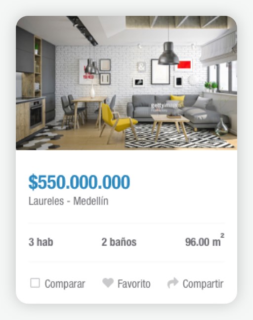
Card de resultado de vivienda

Optimized components to reduce clicks

We designed the results list cards in a way for them to present the more relevant information for each property as well as some important complementary features.

This way we prevent the user from going in and out of pages that do not meet their basic requirements, reducing the number of clicks and drastically improving the search experience.

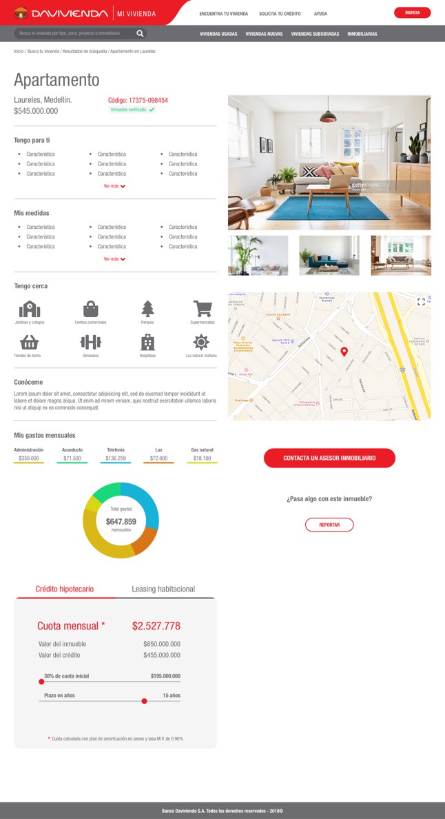
Vertical Rhythm for a harmonious layout

Duo to the large amount of information in several pages of the site, It seemed important to me to define a vertical spacing system that would create a harmonious reading and viewing rhythm.

This way we managed to make the composition look light and pleasant despite the amount of elements.

página de resultados con espaciado armónico