App

My House

Davivienda wanted an app that would complement the home search and financing experience that we had designed for the web.

This, like the website, should facilitate the flows of housing search and financing as much as possible.

Client:

Davivienda

Agency:

Xperience Design

Year:

2018-2019

Role:

UI Team Leader / Senior UI Designer

Process

We started from the same archetypes and research process done for the website design and inmediately focused on ideation and prototyping. We experimented with different design patterns, researched trends and created an internal style guide with a basic components library that would allow the entire UI team to work seamlessly on schedule.

Challenge

We faced two major challenges, the first one was the deadlines, time was unusually short; the second was to try to simplify the complex process of applying for a mortgage through a mobile interface.

To solve the first challenge, we built in the first week a small components library and a style guide that would allow us to work in a team of 3 people, minimizing corrections and errors and thus being able to finish the work on time.
Diseño

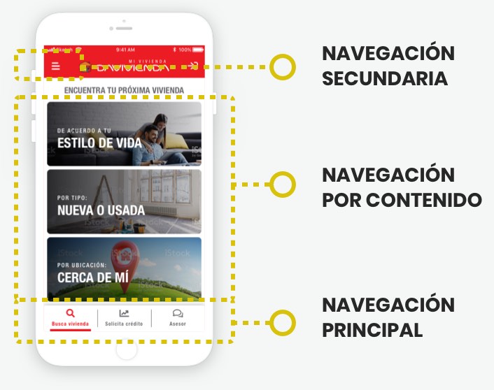
pantalla con navegación resaltada

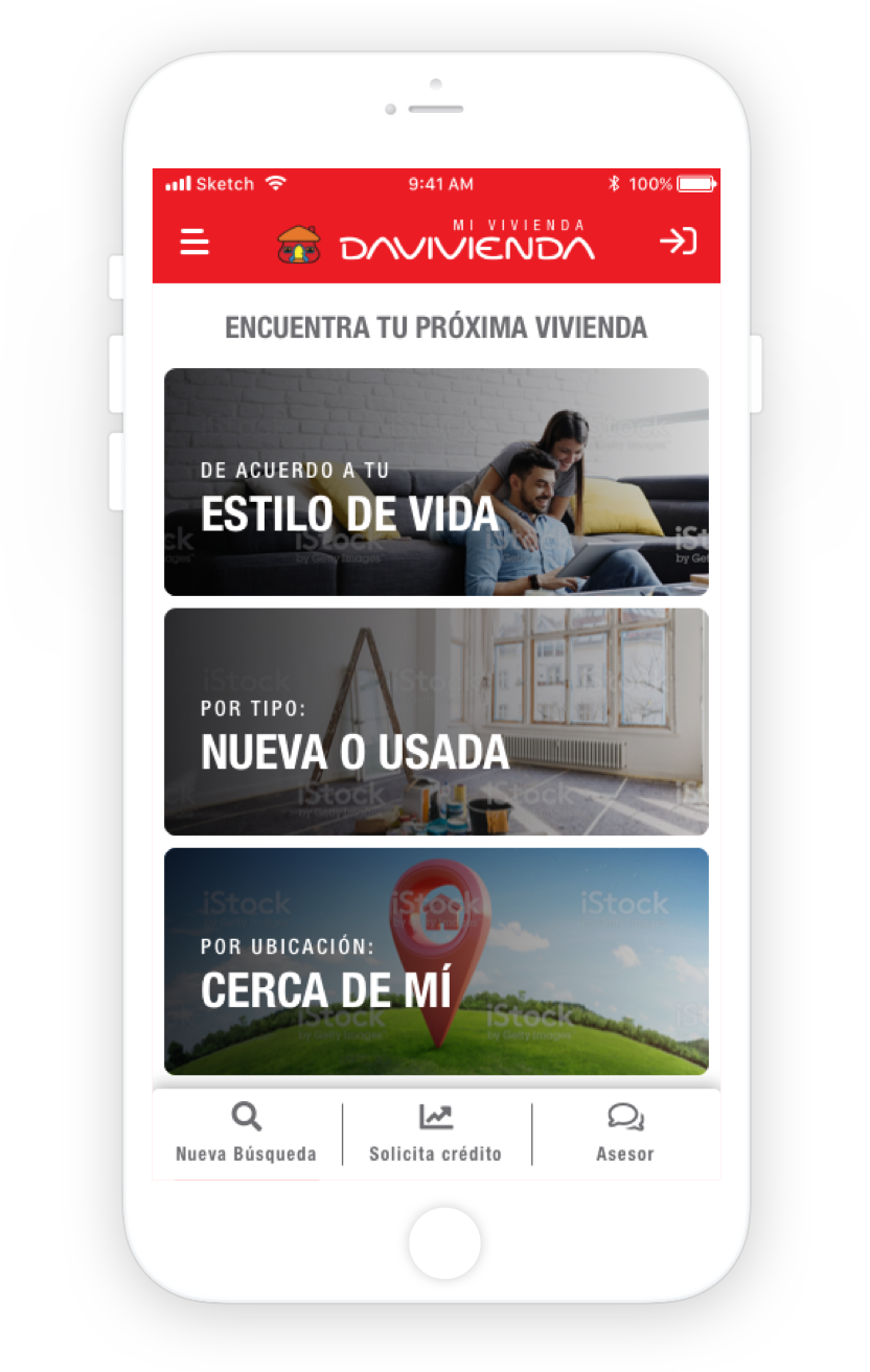
Navigation

Different types of navigation for different contexts and relevances: secondary navigation in a hamburguer menu, main navigation in a bottom tab menu, and content navigation.

Secondary Navigation

Settings and low relevance elements in a hamburguer menu

Content Navigation

Linked content from cards and other classic informative and navigation patterns.

Main Navigation

Top level sections and chat visible most of the time

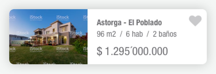
Card de vivienda

Card designed to reduce navigation clicks

Cards are informative and clickable patterns, we put in sight the most relevant information to prevent the user from make unnecessary clicks, optimizing this way the navigation experience.

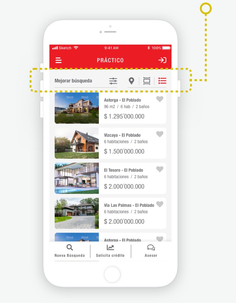
pantalla con filtros resaltados

Filters and visualization tools

We displayed a complete system for filtering, ordering and viewing results, in plain sight, to facilitate the search for the user.

Vertical Rhythm for harmonic reading of elements

Due to the large amount of content displayed on the screen, we decided to use Material Design's 8/4 spatial system in order to achieve a more fluid and harmonious reading of the elements on the screen.