Cinema App

This is a conceptual exercise for a fictional movie theater.

The hypothetical goal is to improve the user experience in the App channel, allowing the company to improve the platform adoption, atract dissatisfied users from the competition, reduce queues at the point of sale and improve overall process efficiency by leveraging the digital channel.
Client:

Agency:

Freelance

Year:

2020

Role:

UX/UI Designer

Process

I defined two User Personas: Manuel and Daniela. They're typical users, different enough to generate an optimal restrictions range.

After that, based on User Personas and project goals I assumed some hypothetical findings of an empathy process. And from those findings I created a features list that would help me as a starting point for product design.

Main Flow

Such a product has several important flows: movie search, booking process, ticket buying, among others. Each of those flows has they're own subset of user journeys.

For this particular case I defined the booking flow as the design goal.

User Personas

/*Although I defined each profile very detailed, in this portfolio I only show a summary with the conclusions that help me in the design process. /

Manuel, 39
Daniela, 25

Out of many possible options for users I defined two that lie at the extremes: Daniela, starting her career with high digital skills and low purchasing power; and Manuel, that has an average salary and lower digital skills. With this selection I cover a wide use range.

The app must then be modern and not boring for Daniela and very intuitive for Manuel. We must optimize the search, booking and buy flows, as well as the trailers visualization process since both use it prior to the decision on the selection of the movie. Some tools will be included to help them choose the best option and make the process frictionless.

Wireframe

/Booking Flow/

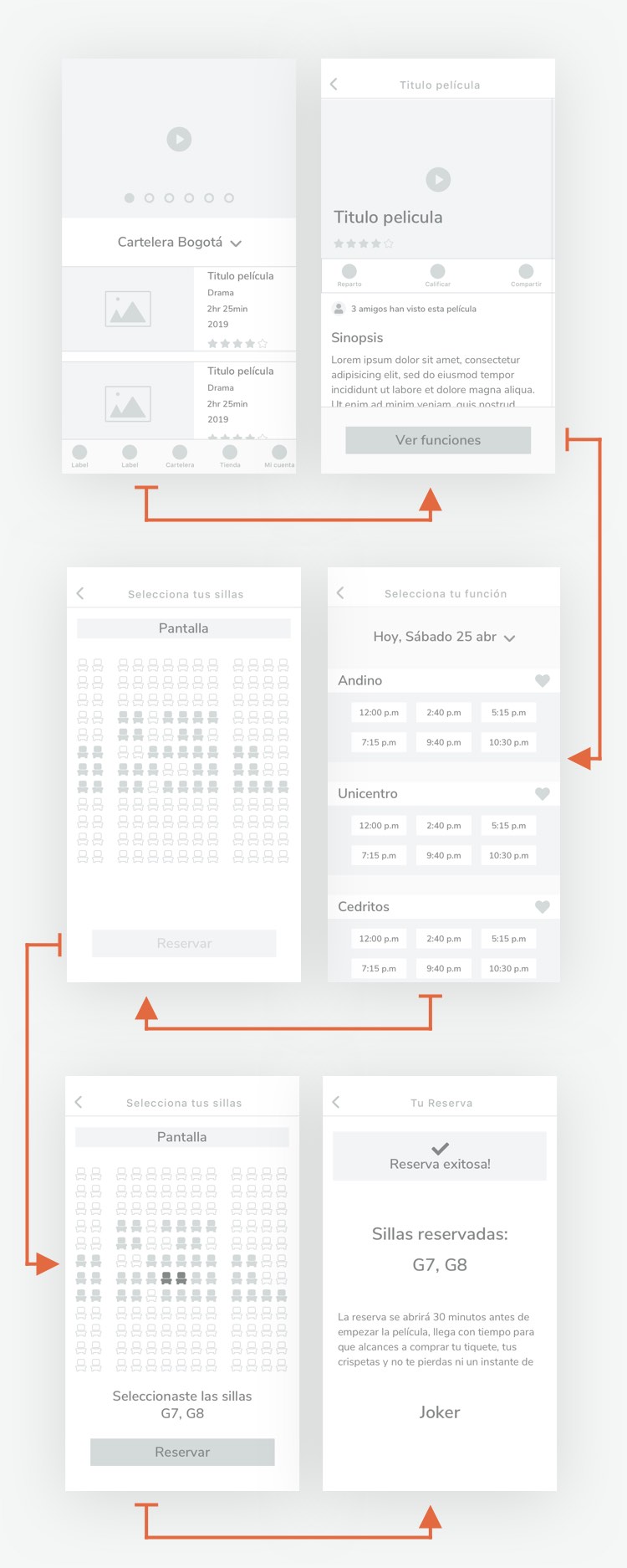
Optimized Booking Flow

Many cinema booking apps have unnecessary steps, such as selecting the number of tickets before starting the reservation process or selecting the theater room before the showtime. These stepst were removed in this flow, making the process shorter and improving the user experience.

imagen wireframe flujo reserva

Design

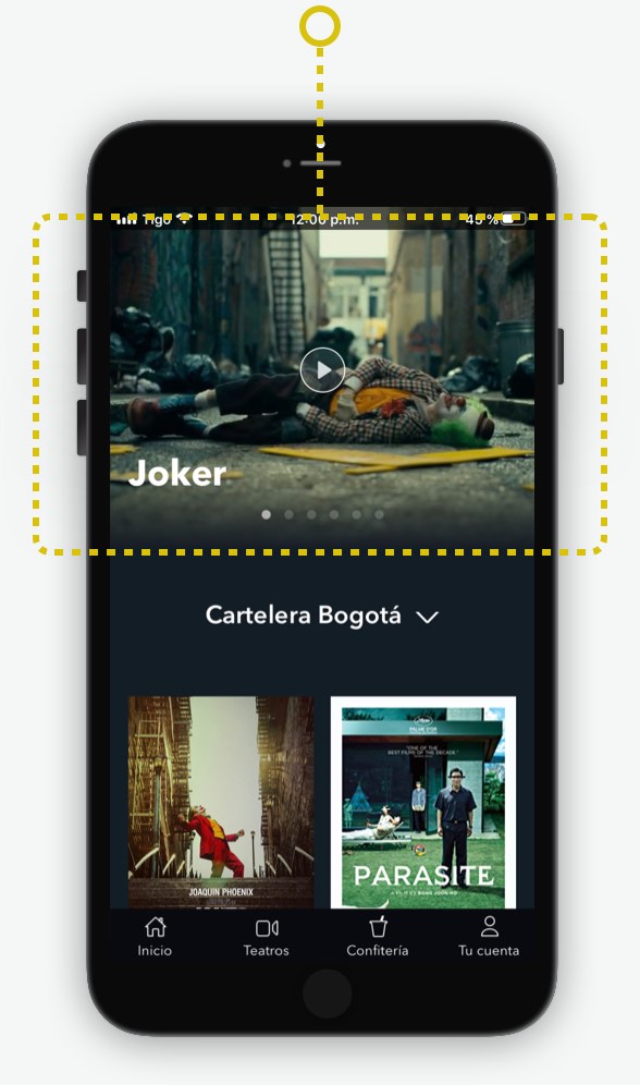
Special Movie Trailers

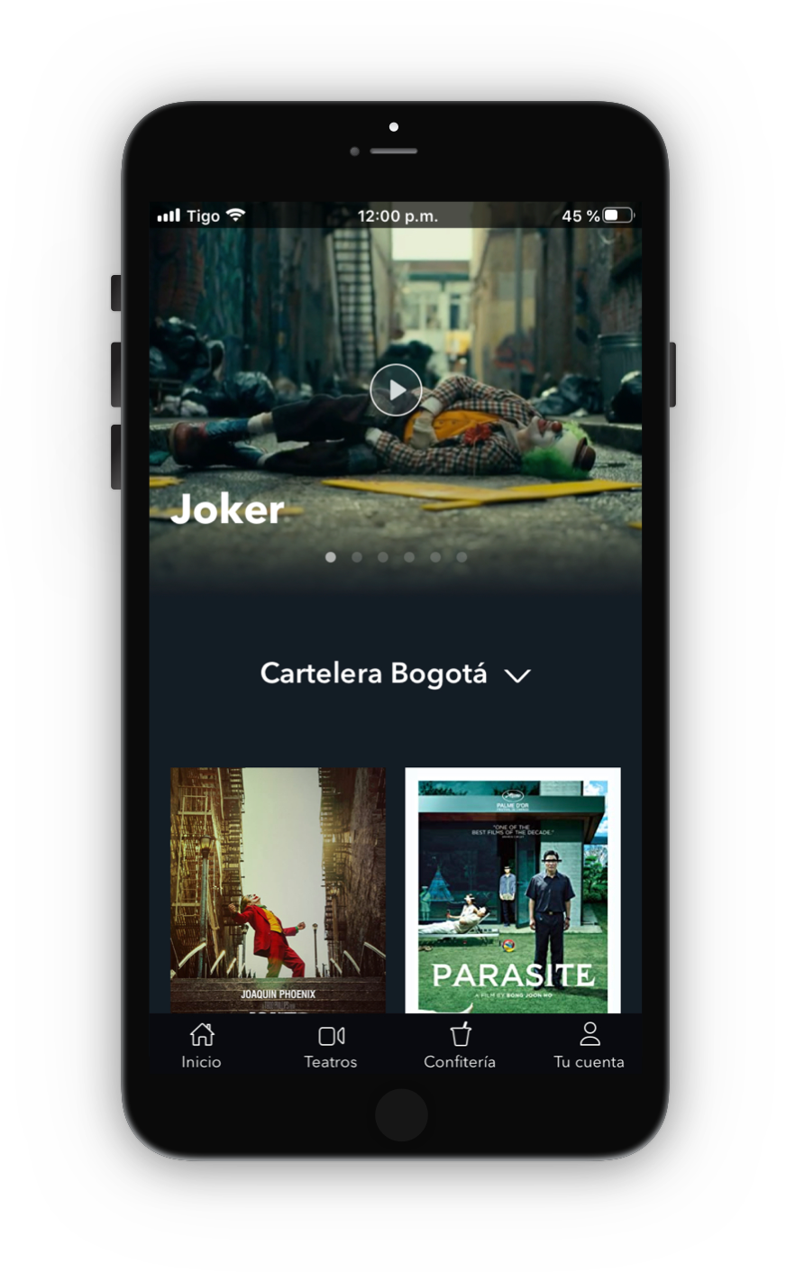
Both User Personas watch the trailers before taking the final decision. That's why I decided tu put the featured movies trailers in the premium section of the home screen.

pantalla con cabezote videos resaltado

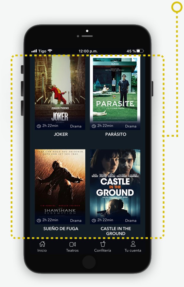
Optimized display of elements on the screen

I arrange the movie cards in a two-column grid. This way I balance the number of cards to see per screen versus the relevance of each one.

More columns would make the screen look too filled with information, resting relevance to each element, and at the same time less elements would make the scroll too long.

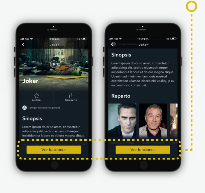
"See Shows (ver funciones)" Persistent Button

For those users that already know what movie to watch, I make it easier to find the showtime and continue with the process, leaving the button fixed at the bottom, always visible.

Chairs Selection Improved Experience

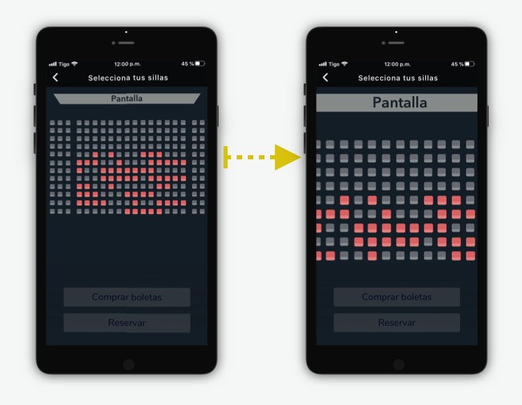
In the (fictional) research, I discovered that the chair icons were too small for the user's finger size, making it difficult to select. To solve this I decided to show at the beginning an arrangement with all chair icons to be later enlarged with the first screen touch and then with bigger icons the user can select the desired chairs easily.

set diferentes pantallas