Gore
Design System + Corporate & Medical Websites
Gore, a globally recognized leader in advanced materials innovation, known for its impact on industries such as textiles, medical, and aerospace, needed to redesign two of its most important websites and develop a Design System to ensure both visual and user experience consistency across all its products.
My Role
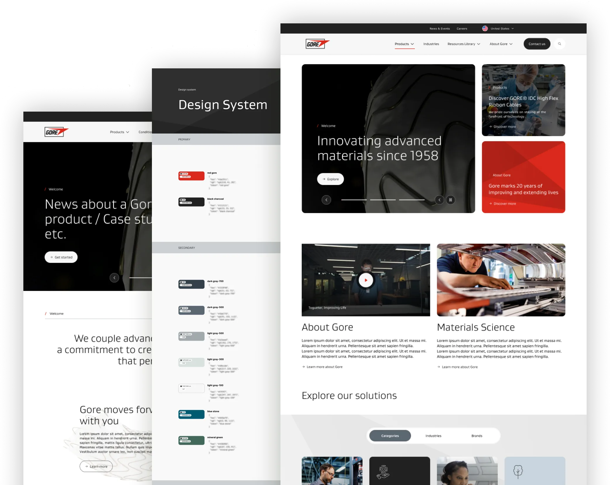
As the Technical Leader (TL) for the design teams, I led the three key projects: a design system, the corporate website, and the medical division website.
Managing three teams of UX and Visual Designers, we ensured consistency, accessibility, and a seamless user experience. My focus was on delivering high-quality, cohesive products on time.
Challenge & Solution
I joined the project as part of a leadership restructuring. The main challenge was to deliver all three products within the timeline set by the previous team while maintaining quality, visual consistency, and a seamless user experience across them.
To achieve this, I worked on restructuring the roadmap, optimizing workflows, and creating collaborative spaces with all three design teams. These initiatives improved communication, enabled quick problem-solving, and streamlined decision-making. Thanks to this approach, we established an efficient workflow that allowed us to meet the demanding requirements of these projects. Below are the three projects where I led the design teams.
Below are the three projects where I led the design teams.
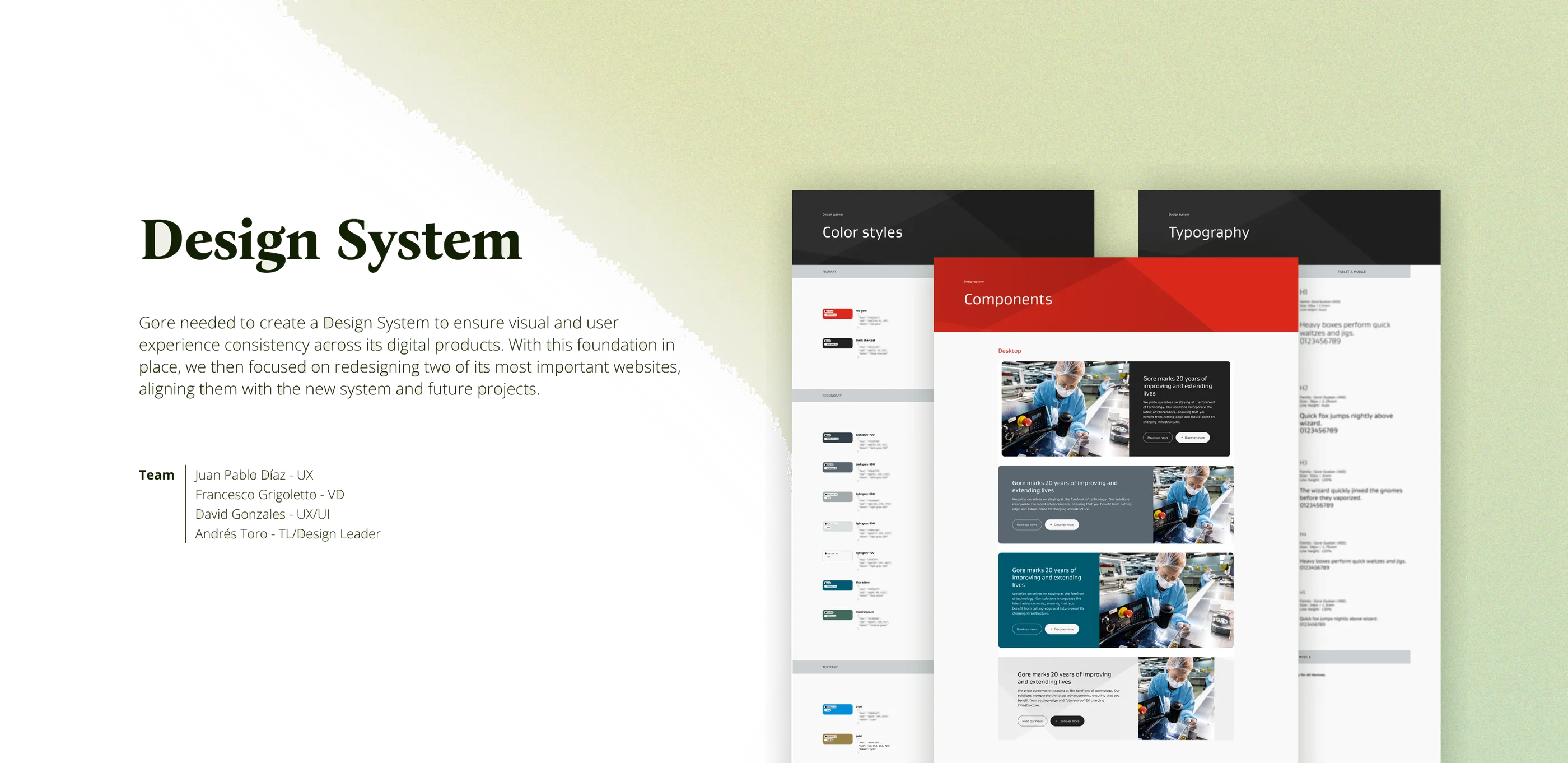
Design System Gore needed to create a Design System to ensure visual and user experience consistency across its digital products. With this foundation in place, we then focused on redesigning two of its most important websites, aligning them with the new system and future projects. Juan Pablo Díaz — UX Francesco Grigoletto — VD David Gonzales — UX/UI Andrés Toro — TL / Design Leader
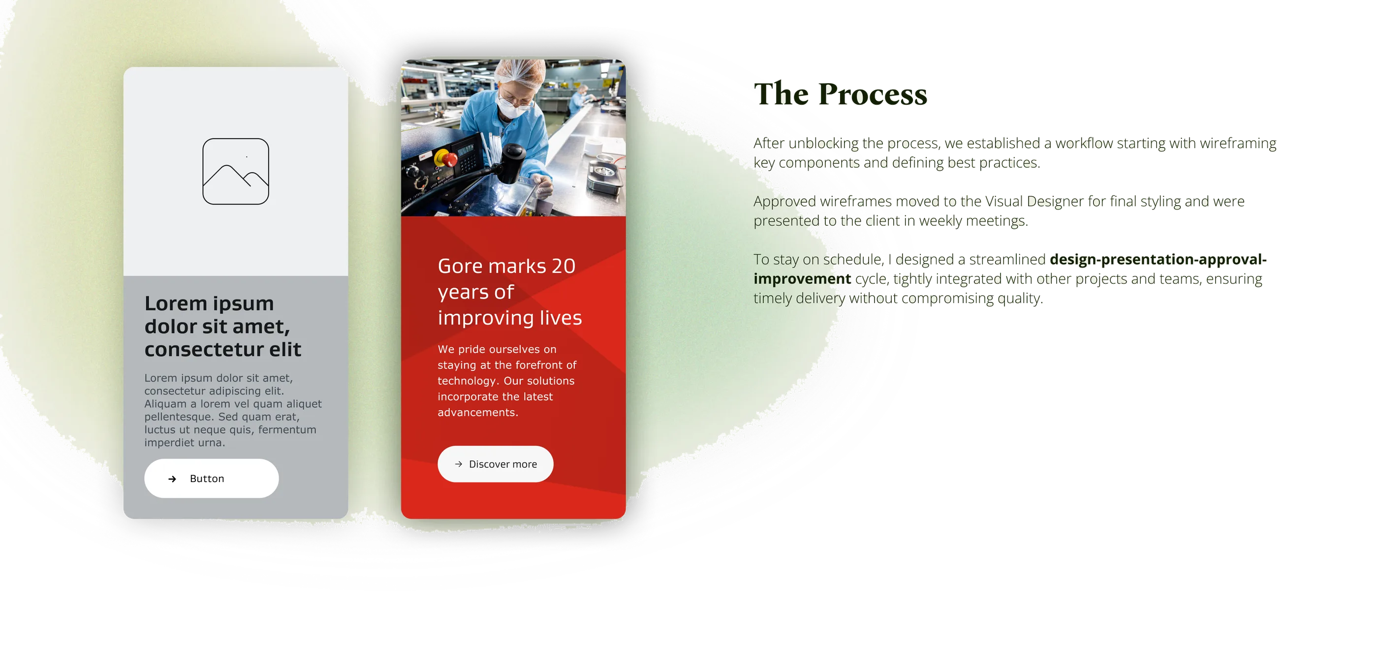
Challenge & Solution When I joined the project, the process had been stuck for several months because the client was not satisfied with the component inventory that had been presented. To resolve this, I organized an intensive workshop with all three design teams. In this session, we analyzed the needs of Gore's websites, conducted a benchmark of reference design systems, and examined competitor sites. Based on this analysis, we consolidated a prioritized list of components. Thanks to this structured approach, we quickly secured client approval, unblocked the process, and moved forward. Another challenge was the documentation of the design system, a crucial element for the development team that had not been considered in the initial planning. To address this without impacting delivery timelines, we established weekly meetings between the design and development teams, allowing real-time issue resolution while progressing with documentation in parallel, avoiding delays for both teams.
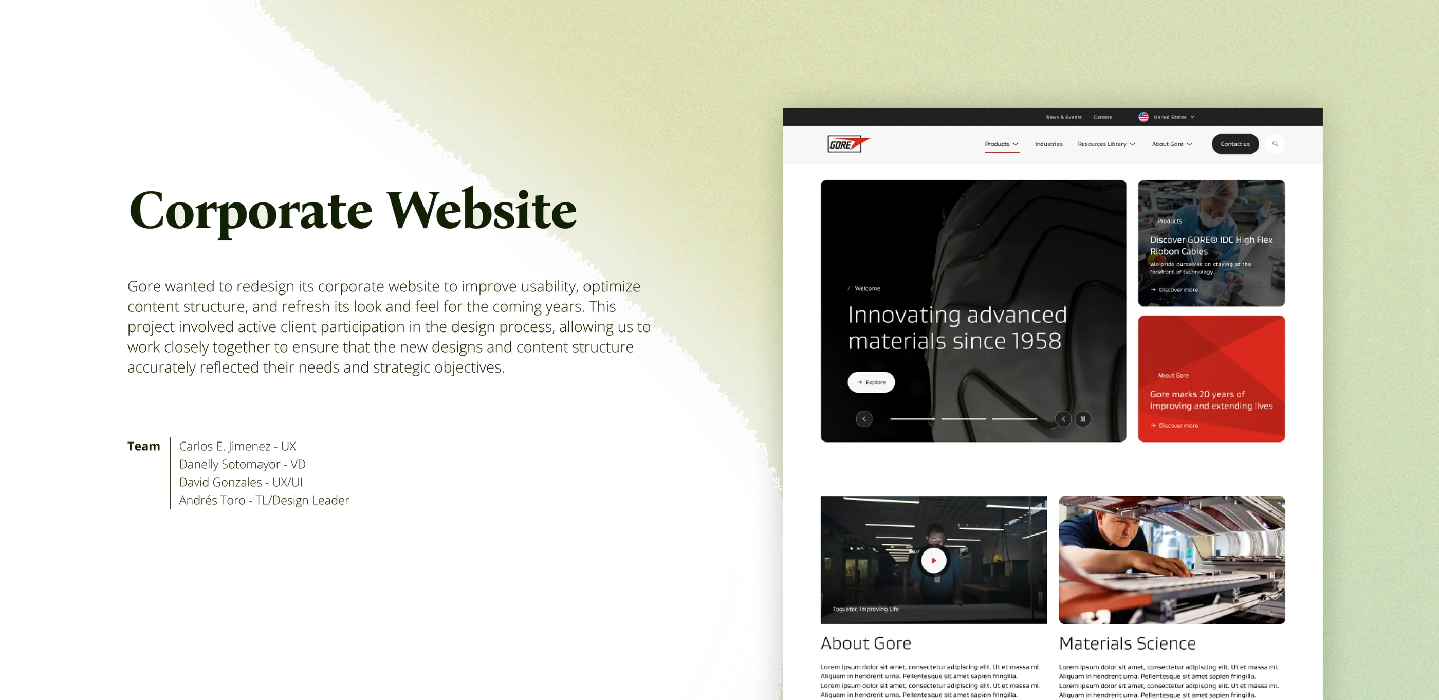
Corporate Website Gore wanted to redesign its corporate website to improve usability, optimize content structure, and refresh its look and feel for the coming years. This project involved active client participation in the design process, allowing us to work closely together to ensure that the new designs and content structure accurately reflected their needs and strategic objectives. Carlos E. Jimenez — UX Danelly Sotomayor — VD David Gonzales — UX/UI Andrés Toro — TL / Design Leader
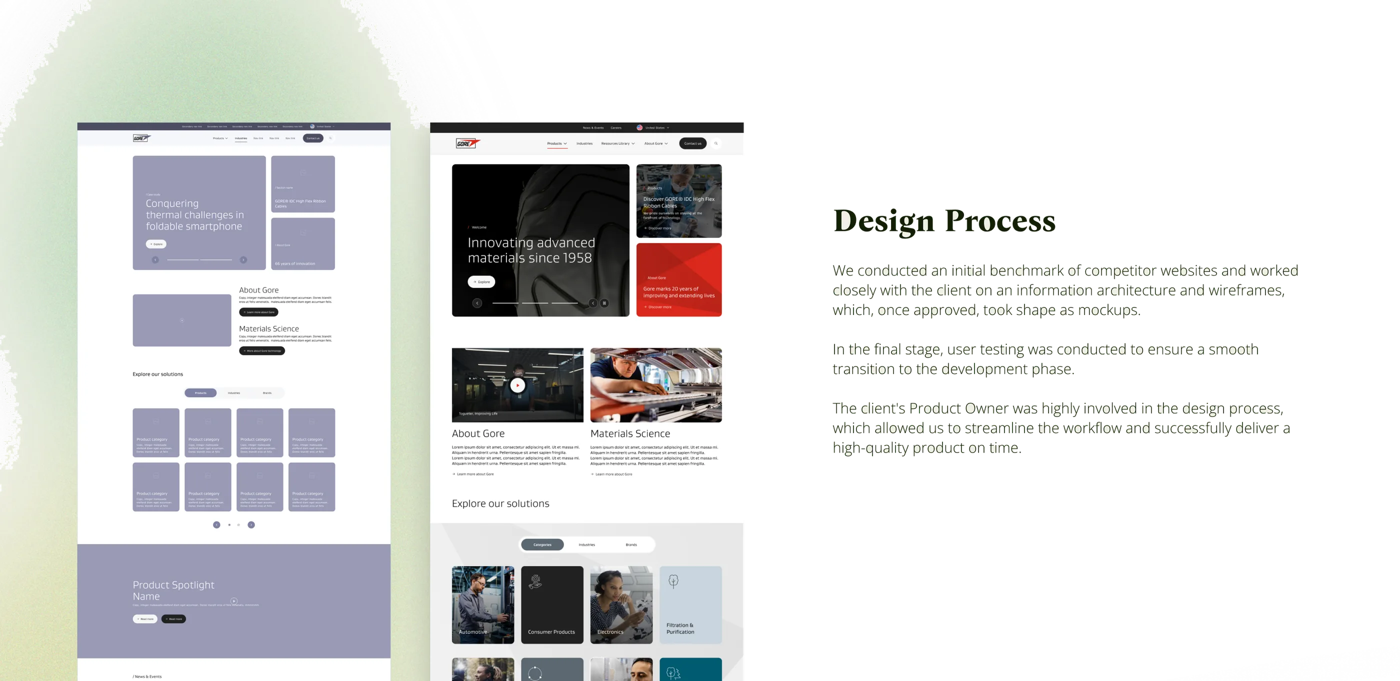
Challenge & Solution From the beginning, the client had a clear vision for the site's structure, and our role was to refine it based on usability principles and UX best practices. Rather than completely redefining the information architecture, we analyzed the client's proposal and worked together to optimize it, ensuring that every adjustment addressed real business and user needs. The wireframe design process followed a collaborative workflow where the client shared initial ideas, and we evaluated, refined, and structured them into a smooth and intuitive experience. The mockups needed to align with the design of the Medical website, which we were working on in parallel. This presented a challenge that we successfully tackled as a team through dedicated meetings and collaborative workspaces with the Medical and Design System teams.
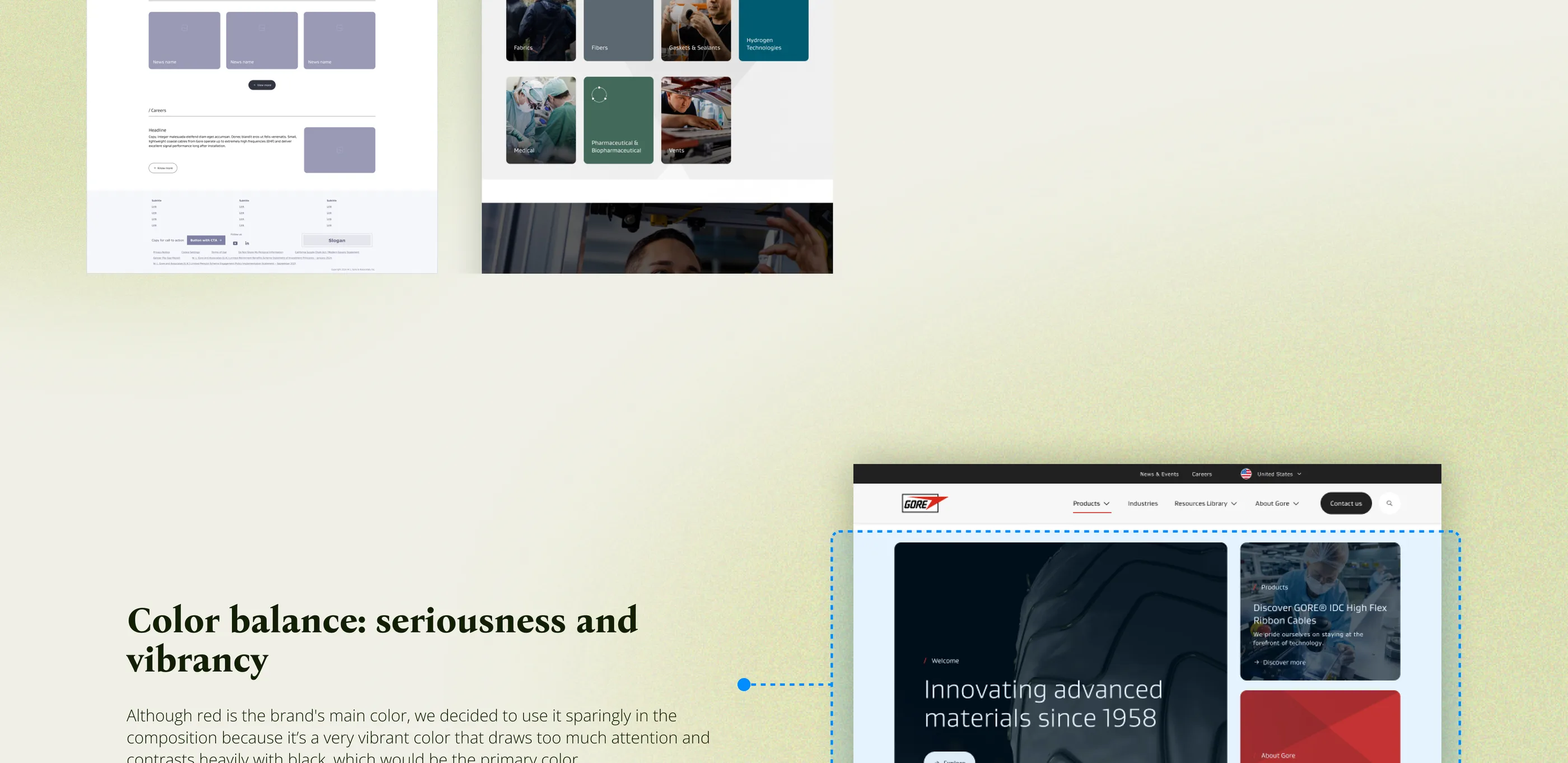
Color balance: seriousness + vibrancy Although red is the brand's main color, we decided to use it sparingly in the composition because it's a very vibrant color that draws too much attention and contrasts heavily with black, which would be the primary color.
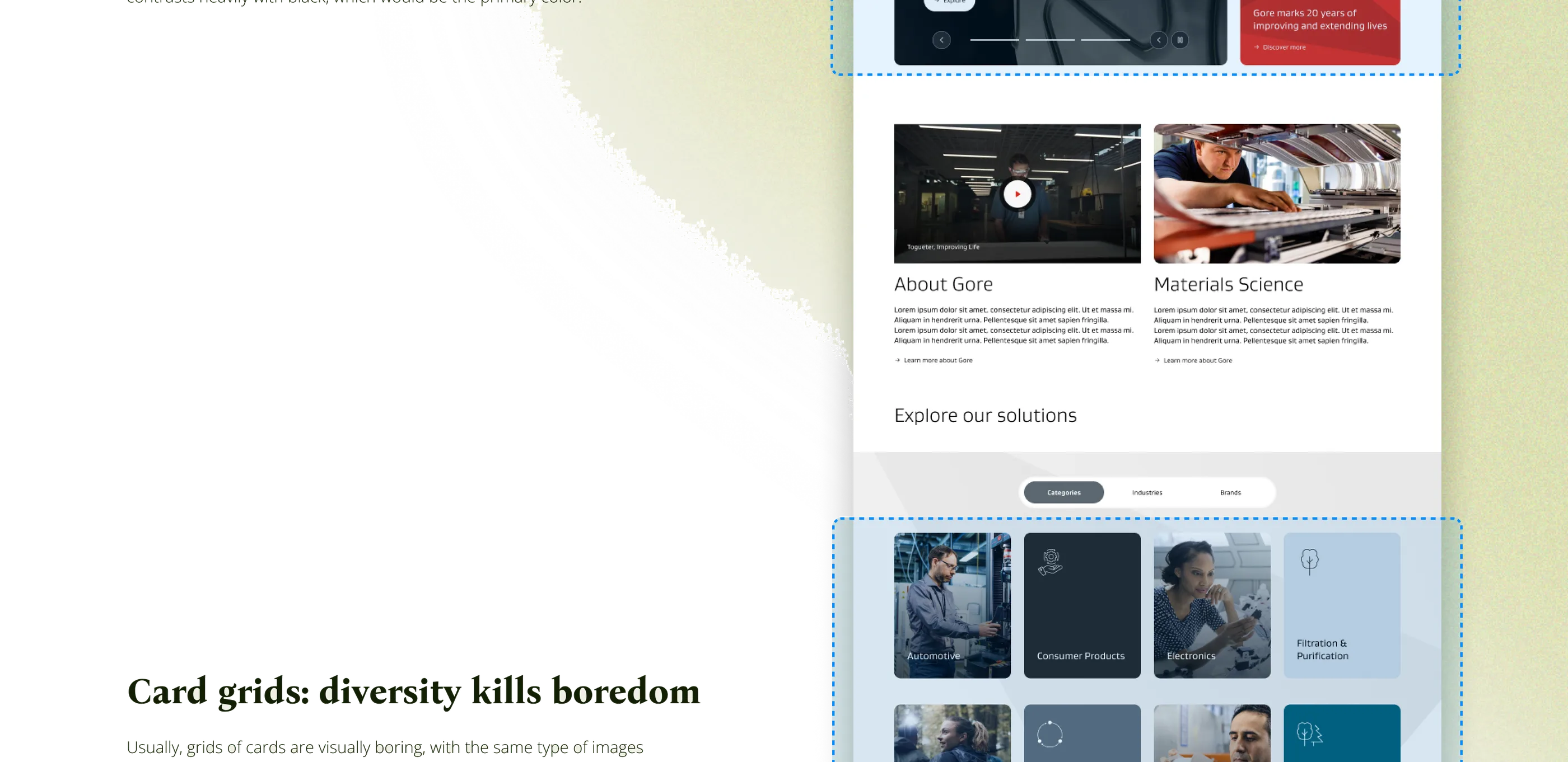
Card grids: diversity kills boredom Usually, grids of cards are visually boring, with the same type of images repeated on the same color backgrounds. We solved that with a mix of image cards and icon tiles, alternating between analogous colors. This helped us break the monotony in a harmonious way.
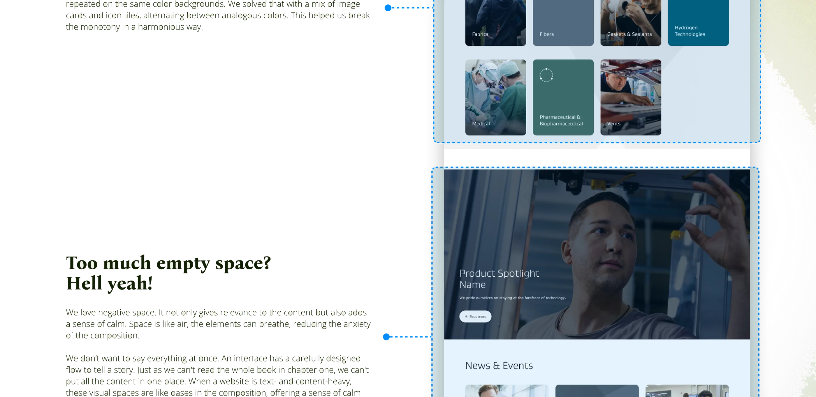
Too much empty space? Hell yeah! We love negative space. It not only gives relevance to the content but also adds a sense of calm. Space is like air, the elements can breathe, reducing the anxiety of the composition. We don't want to say everything at once. An interface has a carefully designed flow to tell a story. Just as we can't read the whole book in chapter one, we can't put all the content in one place. When a website is text- and content-heavy, these visual spaces are like oases in the composition, offering a sense of calm and visual harmony.
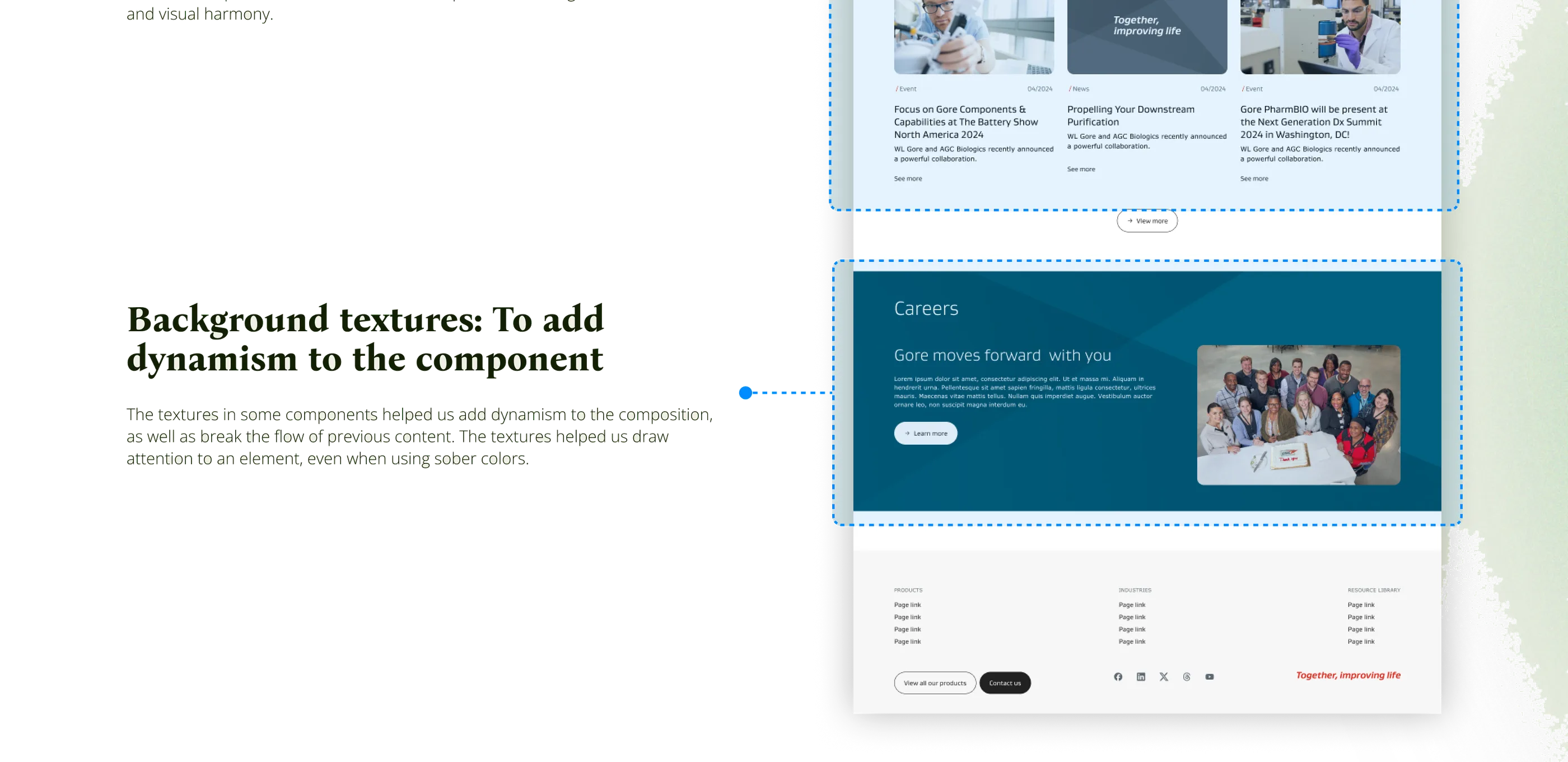
Background textures: to add dynamism to the component The textures in some components helped us add dynamism to the composition, as well as break the flow of previous content. The textures helped us draw attention to an element, even when using sober colors.
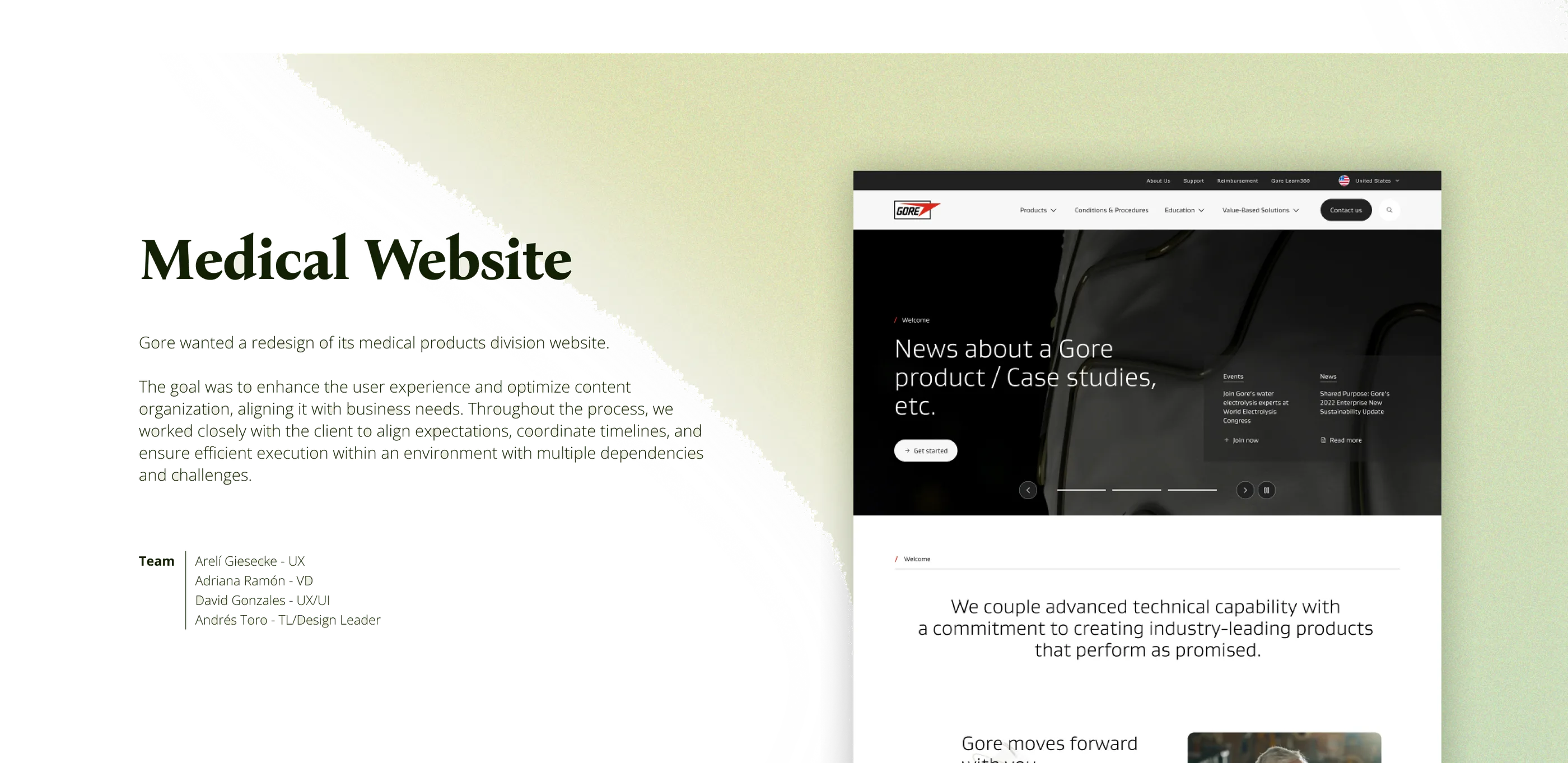
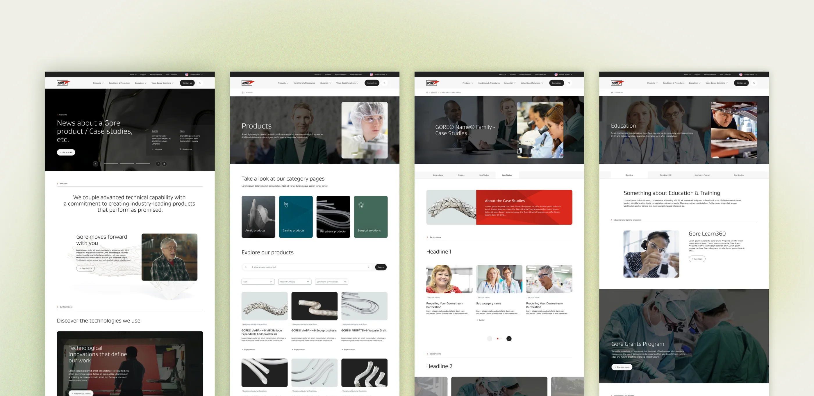
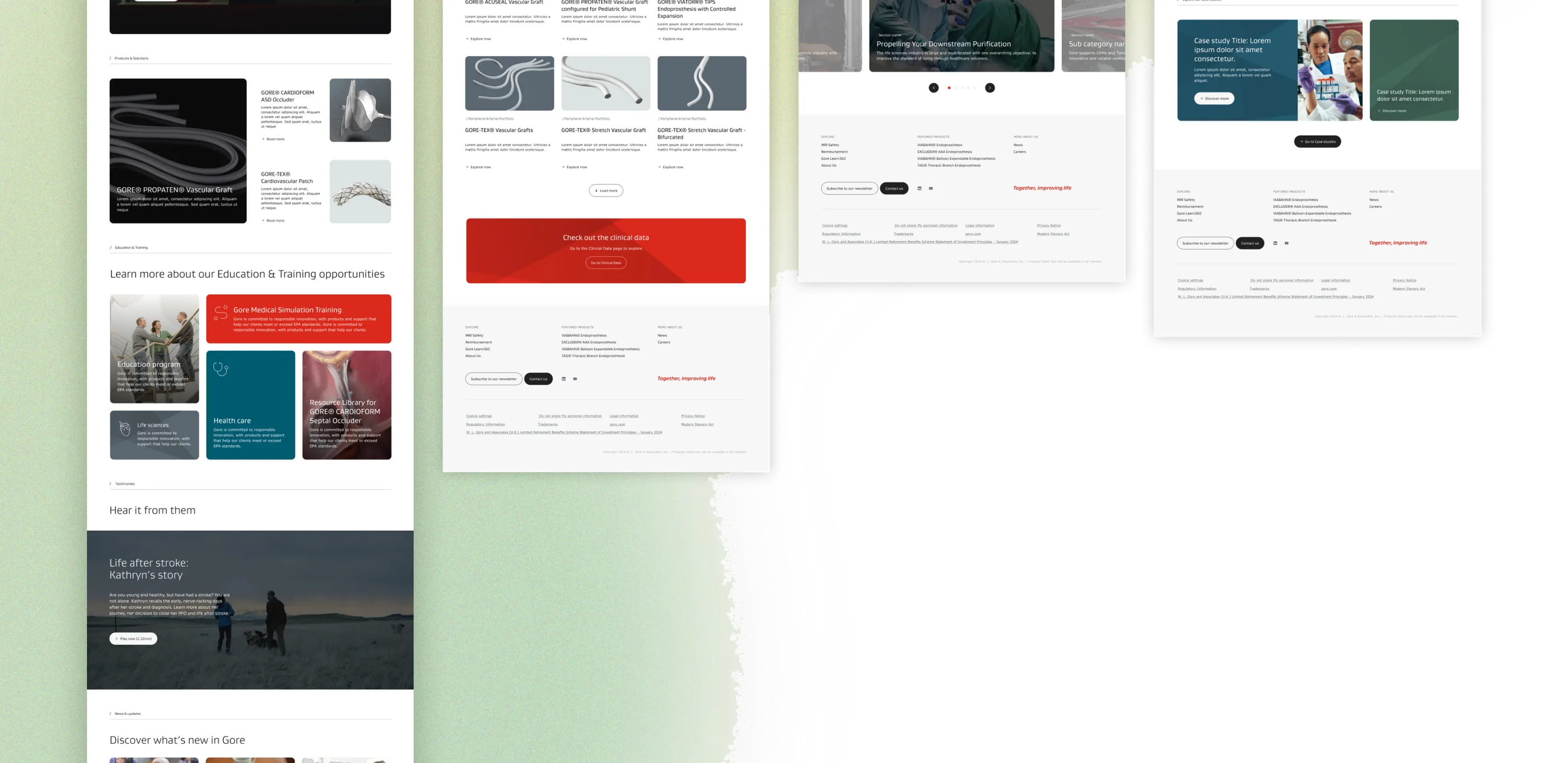
Medical Website Gore wanted a redesign of its medical products division website. The goal was to enhance the user experience and optimize content organization, aligning it with business needs. Throughout the process, we worked closely with the client to align expectations, coordinate timelines, and ensure efficient execution within an environment with multiple dependencies and challenges. Arelí Giesecke — UX Adriana Ramón — VD David Gonzales — UX/UI Andrés Toro — TL / Design Leader
Challenge & Solution One of the biggest challenges was the tight schedule. To optimize design timelines and maintain a steady workflow, I proposed dividing the wireframing process into two phases. In the first phase, we worked with low-fidelity wireframes to validate the overall structure and key element placement. In the second phase, with the Design System available, we refined specific functionalities and visual details. During the mockup phase, we identified opportunities to strengthen visual coherence with other Gore products. Together with David, another senior designer, we refined the designs and established more specific guidelines, which we then shared with the design team to ensure consistency between this project and the Corporate Website. Additionally, we conducted a detailed analysis of the information architecture based on previous studies and current needs, allowing us to propose a clearer and more effective structure.