
Davivienda
MyHouse App
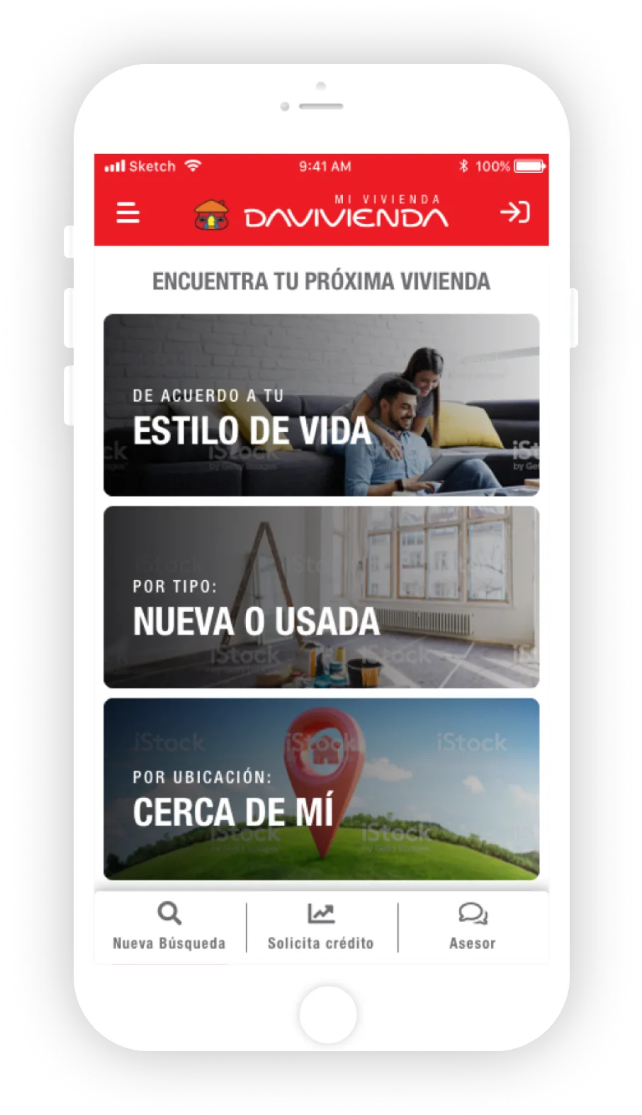
Davivienda wanted an app to complement the home search and financing experience we had designed for the web. Like the website, it needed to streamline the housing search and financing flows as much as possible.
Process
We built upon the same archetypes and research process used for the website design and immediately focused on ideation and prototyping. We experimented with different design patterns, researched trends, and created an internal style guide with a basic component library, enabling the entire UI team to work seamlessly and stay on schedule.
Challenge
We faced two major challenges: the first was the unusually short deadlines, and the second was simplifying the complex mortgage application process within a mobile interface. To address the first challenge, we built a small component library and a style guide within the first week. This allowed our team of three to work efficiently, minimizing corrections and errors, ensuring we completed the project on time.
Navigation
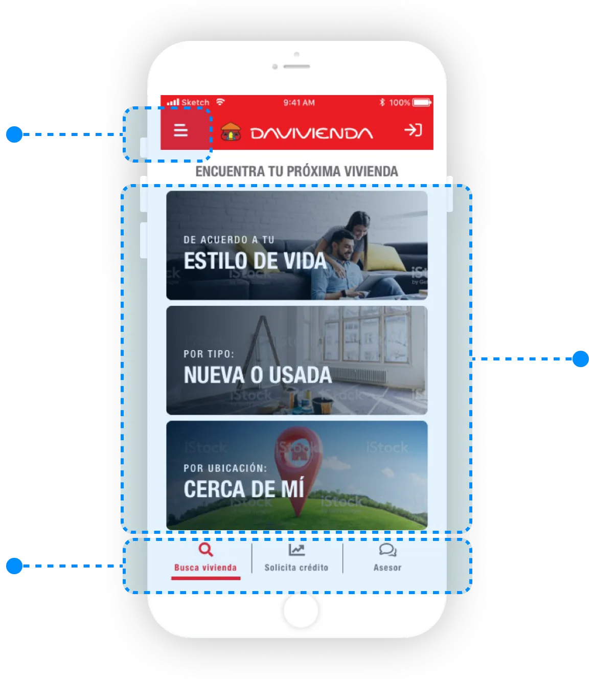
Secondary Navigation
Settings and low relevance elements in a hamburguer menu
Content Navigation
Linked content from cards and other classic informative and navigation patterns.
Main Navigation
Top level sections and chat visible most of the time

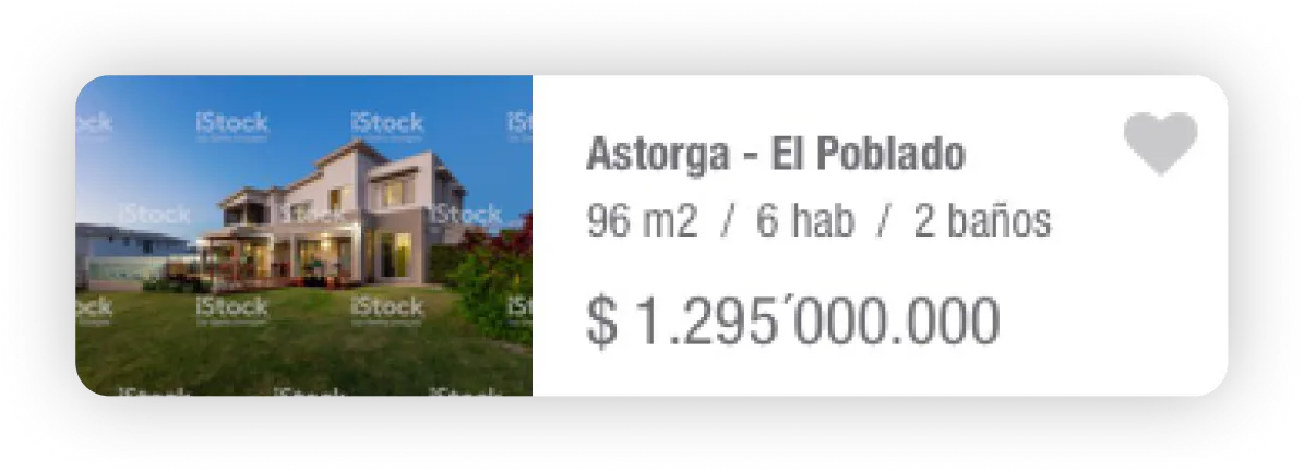
Card designed to reduce navigation clicks
Cards are both informative and interactive elements. We prioritized displaying the most relevant information upfront to prevent unnecessary clicks, thereby optimizing the navigation experience.
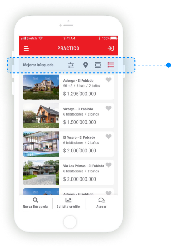
Filters and Visualization Tools
We designed a comprehensive system for filtering, sorting, and viewing results, keeping it easily accessible to simplify the user’s search experience.


Vertical Rhythm for a harmonious layout
Due to the large amount of content displayed on the screen, we decided to use Material Design's 8/4 spacing system to create a more fluid and harmonious reading experience.